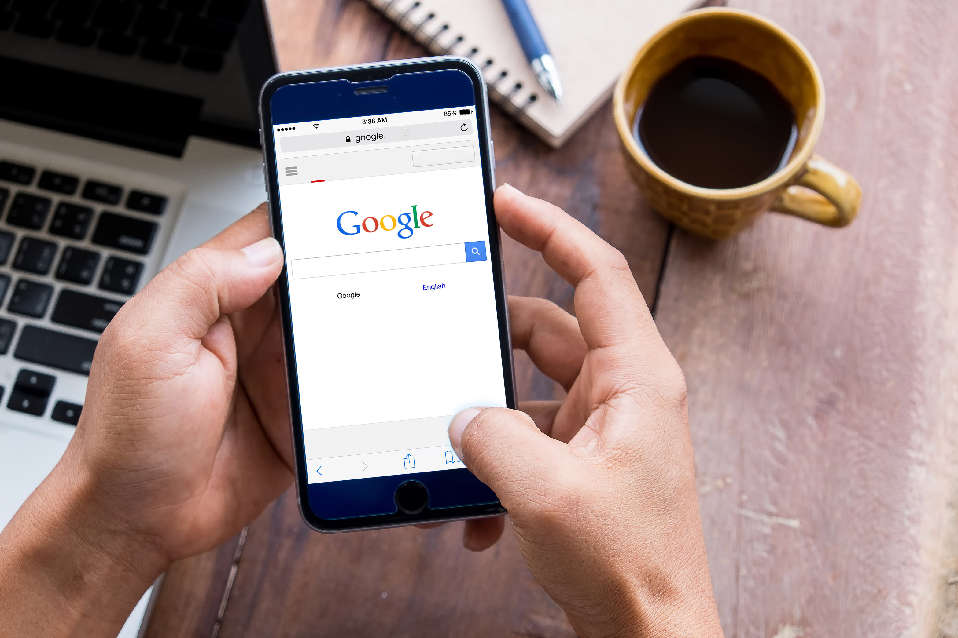
Google is frequently making changes to search results in order to improve user experience. With all the versions they’re testing, it’ll be interesting to see which elements are chosen as there are so many different variations. Here at HeadRed we’re always on the look out for changes being trialed by Google so we can envisage where they are taking the search engine and future impacts upon the SERPs. Below you can see one of the latest tests being completed by Google, trialing out a new style for the SERP on mobile.
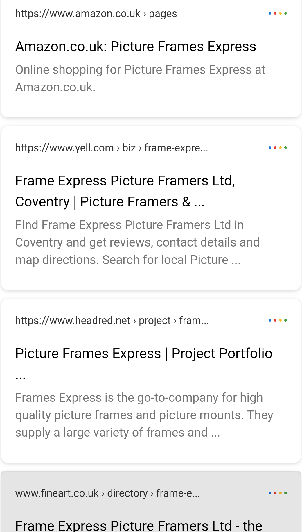
Black URLs and Page Titles
Everything is now black and white. URL is now above the page title. In terms of space, there’s a lot more room for the title and meta description. The only colour on the page are the horizontal dots in Google’s colours on the right of the result.
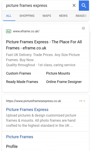
Branded Searches in Blue
With this new mobile search, we have found that for exact match brand searches the top, the brand sites Page title is returned in the blue text we’re used to, and other results are returned in the basic black and white you see above. This wasn’t replicated against every brand search we completed so it’ll be interesting to see over time how Google is prioritising results being displayed in the more prominent blue text. As you can see Google in this version has also retained the green icon next to paid ads being displayed.
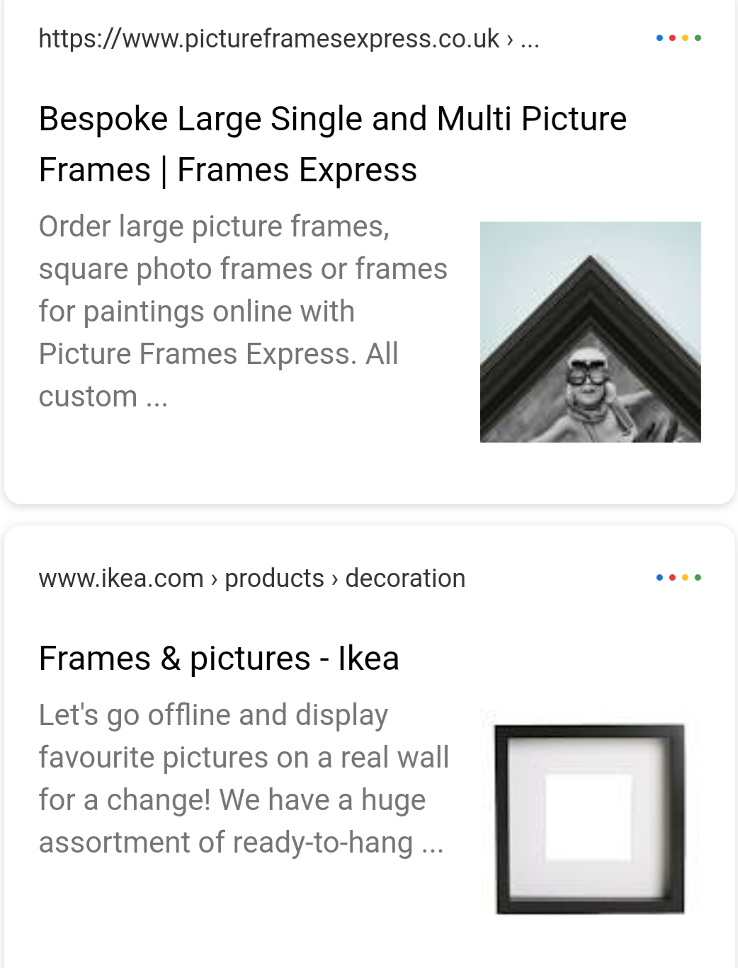
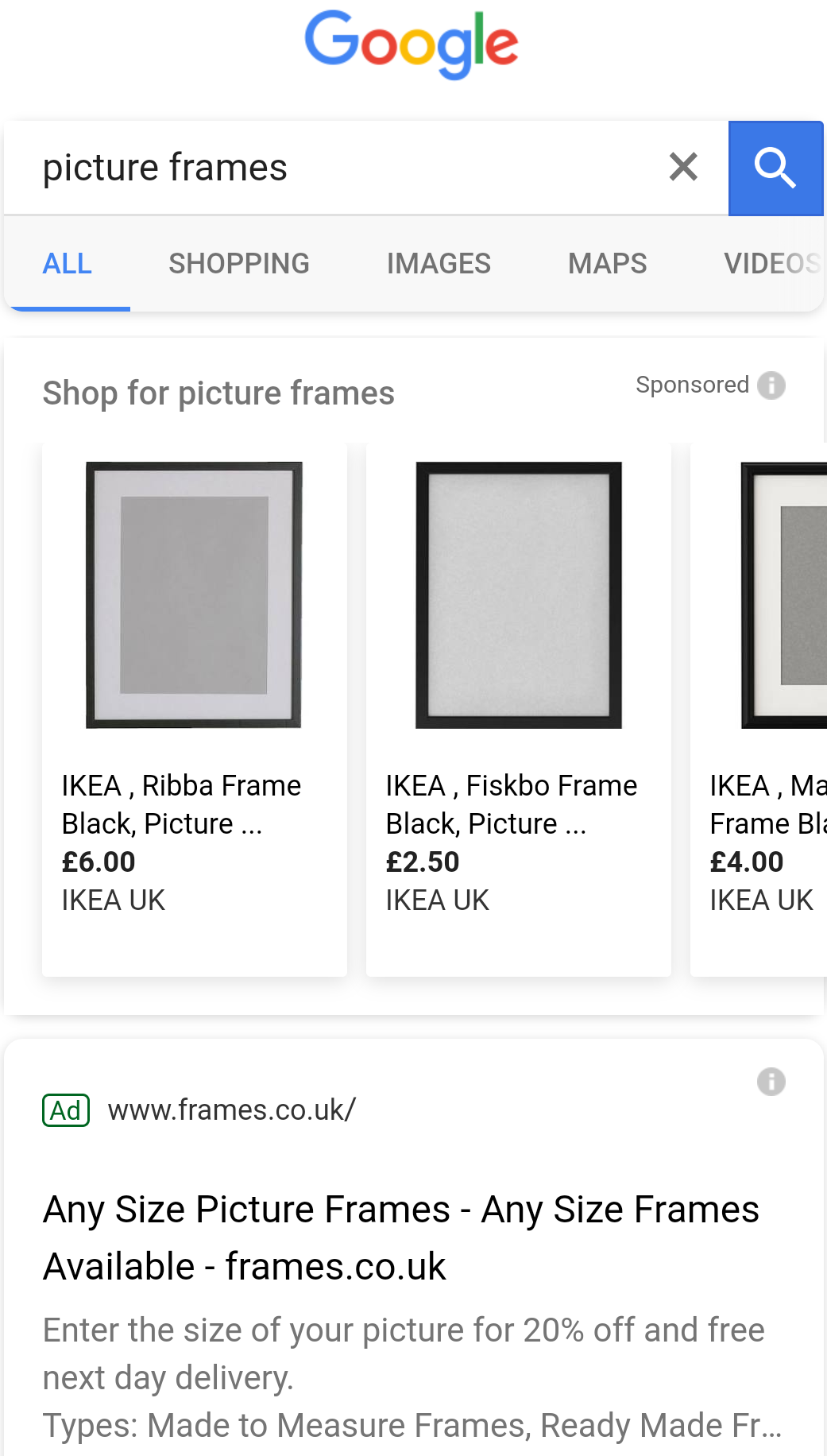
Black URLs & Page Titles For Product Searches
This is the appearance of product based searches on Mobile, which gives the image itself a lot more attention as it’s one of the only colour elements on the page.
Black URLs for Shopping and Search Adverts
In this shot we can see the new format for Google Shopping and Search advertisements.
Social Search Results With Black URLs
This image reveals the layout for search results directly to social media.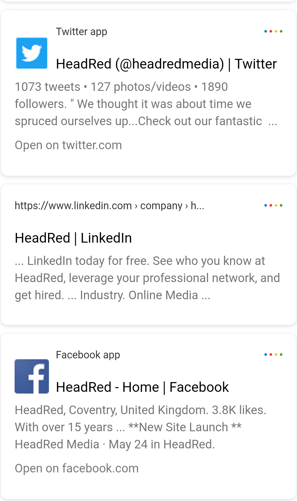
Our Thoughts
It’s great to see the latest trials being completed by Google, currently this one we have only seen in office on one device but there have been many reports of it popping up. As it’s all about user experience, the main thing we found was that having the plain black and white and URLs displayed above the page title took a lot of getting used to, we found ourselves ignoring the URLs a lot more and instead relying upon titles to direct where we clicked showing how prominence in the future of Google SERPs could move a lot more toward optimising page titles and calls to action, and a lot less upon clicking upon web addresses you recognise.
Are you seeing anything different?
Google are always running some kind of test. It’ll be interesting to hear directly from them when launch day comes why they’ve decided to change this.
Let us know your thoughts, and keep up to date with the latest developments by visiting our blog.